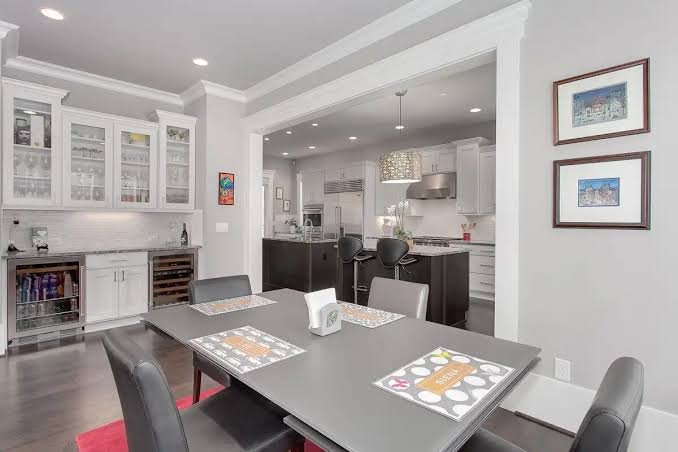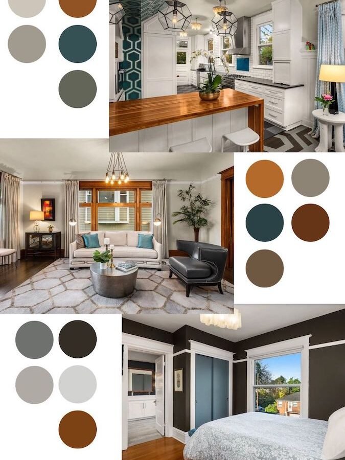
You’ve probably done this already — painted one room a color you loved in the store, only to hate it once it’s actually on the wall. Then the next room gets picked completely on its own, with zero thought to how it connects to the first. A few rooms later, your house looks like five different people decorated it.
That’s exactly the problem a proper home color palette guide is meant to solve. Choosing colors room by room, in isolation, is probably the single biggest mistake homeowners make. The fix isn’t complicated, but it does require thinking about your whole home as one connected story rather than a series of unrelated rooms.
Let’s get into how to actually do this, without hiring a designer or losing your mind over paint swatches.
Why a Whole-Home Color Strategy Actually Matters
In short: a whole-home color strategy creates visual flow between rooms, so your house feels intentional and connected instead of chopped up into mismatched sections. It also makes resale easier, since buyers respond better to homes with a cohesive look.
Here’s the thing nobody tells you at the paint shop — colors don’t exist in isolation. The blue in your bedroom is going to be visible from the hallway. The hallway color peeks into the living room. Open a few doors and suddenly three “unrelated” choices are all fighting for attention at once.
I’ve walked into homes where every single room was individually well-designed, and the overall effect still felt chaotic. Not because any one room was ugly — because nothing spoke to anything else.
A good whole-home palette doesn’t mean everything matches exactly. It means there’s a thread running through the place. Maybe it’s a warm undertone throughout. Maybe it’s one accent color that shows up in three different rooms in different amounts. Either way, your eye moves through the house without hitting visual speed bumps.
Start With What You Can’t Change
Before opening a single paint catalog, look around at your fixed elements — flooring, countertops, exposed brick, wood cabinetry, even your main door. These aren’t changing anytime soon, so your palette needs to work with them, not against them.
A lot of Indian homes have marble or vitrified tile flooring in warm beige or grey tones. If yours does, that’s your starting point whether you planned it or not.
- Note your flooring’s undertone — warm (yellow/beige) or cool (grey/blue)
- Check your existing woodwork, doors, and window frames — teak wood pulls warm, while white UPVC frames lean cooler
- Look at large furniture pieces you’re keeping, like a solid wood dining table
- Consider how much natural light each room gets, since light changes how a color reads
Skipping this step is how people end up with a grey sofa in a room with warm honey-toned flooring, and it just never quite looks right, no matter how nice each piece is individually.
Pick One Anchor Color for the Whole House
This is probably the most useful single tip in this entire guide. Pick one anchor color — usually a neutral — that appears in some form in every room of your home.
It doesn’t have to be the dominant color everywhere. In your living room it might be the wall color. In your bedroom, just the curtains. In your kitchen, maybe it’s the cabinet finish. The point is repetition, not domination.
Popular anchor choices for 2026 Indian homes include warm greige (grey-beige), soft sage, and muted terracotta — all of which pair well with wood tones and natural light. Picture a 3BHK apartment in Pune where the same warm off-white shows up as the living room walls, the bedroom trim, and the kitchen cabinet color. Three totally different rooms, one quiet thread tying them together.
Use the 60-30-10 Rule in Every Room
Quick answer: the 60-30-10 rule means 60% of a room should be your dominant color (usually walls), 30% a secondary color (furniture or textiles), and 10% an accent color (decor, cushions, art). Applying this consistently room to room is what makes a home color palette guide actually work in practice.
This ratio isn’t just a decorating trick, it genuinely keeps rooms from feeling overwhelming. Too many people try to give three or four colors equal weight, and the room ends up looking busy instead of curated.
Apply this same 60-30-10 logic to your whole house too, not just individual rooms. If warm neutrals make up 60% of your overall home, and one accent color (say, deep blue) shows up as the “10%” in your living room cushions, your bedroom art, and your kitchen crockery — that repetition does more for cohesion than almost anything else.
Choosing Colors for Different Light Conditions
North-facing rooms in India tend to get cooler, flatter light through the day, while south and west-facing rooms get warmer, harsher light, especially in summer. This genuinely changes how colors look, sometimes dramatically.
A soft blue-grey that looks calm and sophisticated in a bright south-facing room can look downright cold and gloomy in a dim north-facing one. I’ve noticed clients get frustrated over this exact thing — the same tin of paint, two completely different results in two rooms.
A few practical fixes:
- Test paint samples directly on the wall you’re painting, not just on a card held near a window
- Check the sample at three times of day — morning, afternoon, and after dark with your actual bulbs on
- In darker rooms, lean warmer or lighter than you think you need to
- In very bright rooms, richer and slightly deeper shades often hold up better than pale ones, which can wash out
Don’t trust the paint chip alone. Ever bought a color you loved on paper and regretted it the moment it went on your actual wall? Most of us have.
Transition Zones: Hallways, Staircases, and Open Areas
Hallways and staircases are the unsung heroes of a home color palette guide — and also the most commonly ignored part of it. These are the connective spaces where one room’s color literally meets another’s.
The safest approach is to keep transition areas fairly neutral, since they’re going to be visible alongside whatever colors you pick for the rooms branching off them. A hallway painted a bold mustard yellow might look great on its own, but if it’s sandwiched between a sage green bedroom and a navy study, you’ve basically built a color pile-up.
Some homeowners use the transition space as their anchor color specifically, since it’s seen constantly and touches everything else. That’s not a bad instinct at all.
Room-by-Room: How Much Variation Is Okay?
You don’t need every room the same color — that would honestly be a little boring, and not what most people actually want from their homes. Variation is good. Chaos is the thing to avoid.
A reasonable approach: let each room have its own personality, but keep 2-3 palette elements consistent throughout — maybe a shared trim color, a shared neutral, and one recurring accent shade. Kids’ rooms can be more playful. A home office can lean deeper and moodier. Just don’t let every room start from a completely blank slate.
My Honest Take: Don’t Overthink the “Rules”
Here’s my honest opinion, and this might go against what half the design blogs tell you — a lot of homeowners overthink this to the point of paralysis. Color theory and undertones matter, sure, but at some point you have to just commit and see how it feels living in the space.
I’d rather see someone pick a slightly imperfect but cohesive palette and actually paint their home this year, than spend eight months debating between eleven shades of white. Perfection isn’t really the goal here — a home that feels put-together and comfortable is.
If a color genuinely makes you happy every time you walk into that room, that matters more than whether it perfectly follows the 60-30-10 rule.
[link to related guide on choosing paint finishes for different rooms here] [link to related guide on lighting design for Indian homes here]
FAQ: Home Color Palette Guide
How many colors should I use in a whole home color palette? Most designers suggest 3-5 colors total across your home — one anchor neutral, one or two secondary colors, and one or two accents. More than that and things start feeling scattered rather than intentional.
Should every room in my house be the same color? No, and honestly it’s not even desirable. Each room can have its own character. What matters is keeping a few shared elements — like trim color or one repeated accent — running through the whole home.
What’s a good anchor color for Indian homes in 2026? Warm neutrals are trending strongly right now — think greige, warm white, soft sage, or muted terracotta. These pair well with common flooring choices like marble and vitrified tiles and hold up in both warm and cool light.
How do I know if a color has a warm or cool undertone? Hold the paint chip next to a plain white sheet of paper in natural daylight. If it looks yellowish, pinkish, or beige-leaning, it’s warm. If it looks bluish or greyish, it’s cool.
Does ceiling color matter in a whole-home palette? It matters more than people think. A stark white ceiling against warm walls can look slightly jarring. Many designers now suggest a very soft tint of the wall color on the ceiling instead of pure white, for a more finished look.
Can I hire someone just for color consultation without a full renovation? Yes, and it’s often worth it. Many interior consultants in India offer standalone color consultation services for anywhere between ₹5,000 and ₹20,000 depending on your city and home size, without requiring a full design package.
Conclusion
Getting your home color palette guide right isn’t about finding the one perfect color everyone will love. It’s about picking a handful of shades that talk to each other across your whole home, working with what you already have, and testing before you commit to gallons of paint.
Start small if you’re overwhelmed — pick your anchor neutral this week, and figure out where it’ll show up in each room. The rest tends to fall into place once that first decision is made. Grab a few sample pots before you buy full cans, and give them a few days on your actual walls before deciding anything is final.